
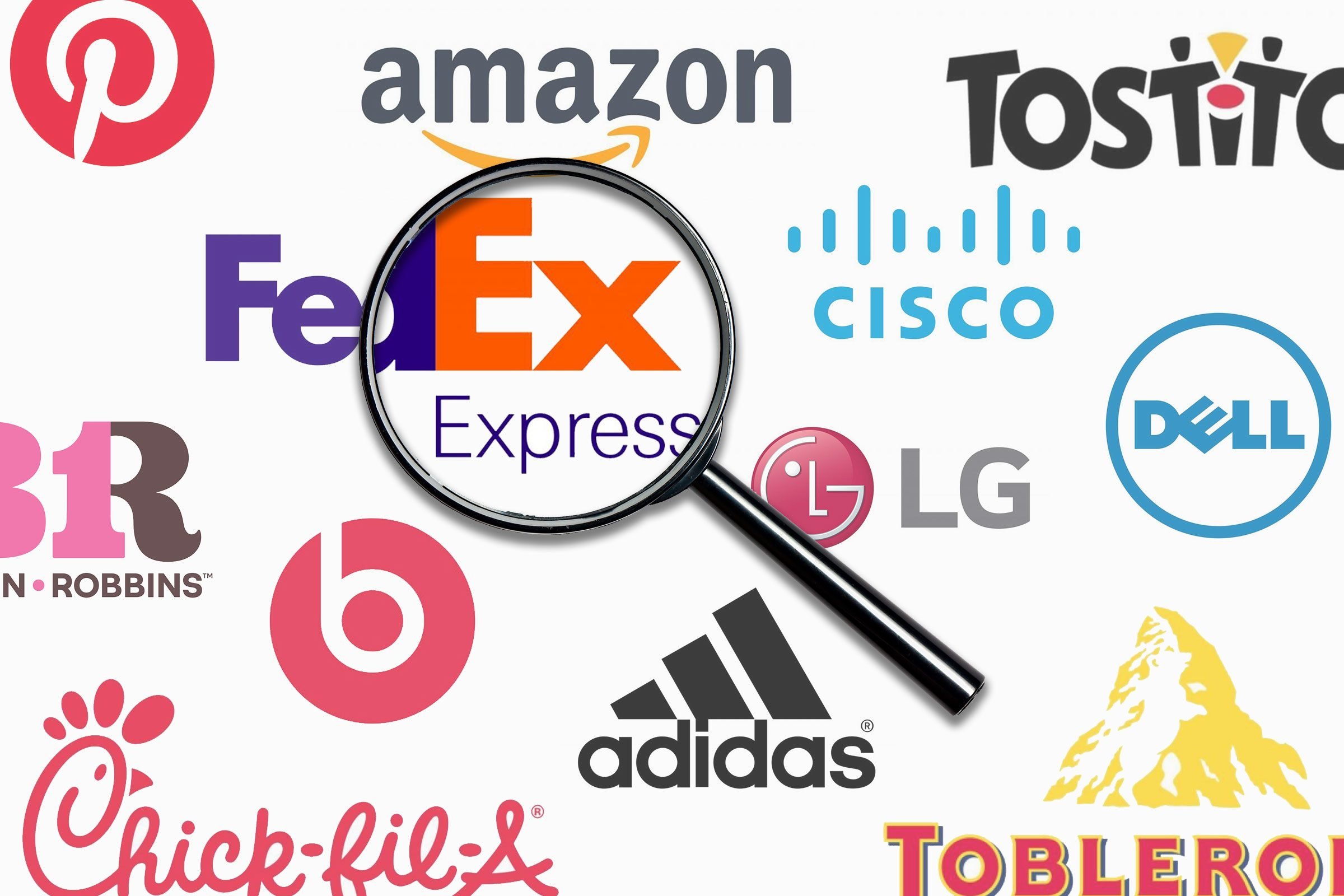
Ok something fun for a Tuesday. Did you look at a company logo and see a hidden symbol, number, or word? Or why did the Apple icon have a bite in it? Well here you go and this was provided by www.rd.com and written by Kelly Kuehn:
"What do Apple, Amazon, Baskin Robbins, and Toblerone have in common? They have hidden messages in their logos—here's what they are and what they mean.
Did you know these logos have hidden messages?
As consumers, we see company logos daily. If you stop at 7-Eleven, you see its logo as soon as you pull in. If you make a pit stop at Dunkin’ for coffee, you’ll carry its logo on your coffee cup. Logos are everywhere, but have you ever stopped and really looked at them? There’s more to them than meets the eye.
Turns out, many companies have hidden messages in their logos. Companies like Starbucks, Amazon, and even Goodwill strategically designed their logos to convey subtle messages about things like company values and products. Logos can also try to subconsciously influence buying behavior, which partially explains why so many logos are red. Read on to discover the hidden messages in logos you see all the time.
Baskin Robbins
Baskin Robbins is known for its ice cream, but did you know there’s a hidden message in the logo? Look closely, and you’ll see the number 31 in the initials—as in the number of flavors the company began offering in 1953. Why 31 flavors? It’s one for every day of the month, so you can try something new every day. Yum! The company recently unveiled a new logo (its first major refresh since 2006), but don’t worry—you can still spot the 31 in it.
Amazon
Amazon is a staple in many online shoppers’ lives, but have you ever wondered what that little arrow at the bottom of the logo means? It’s not just a fun design element—the arrow broadcasts the wide variety of stuff (from A to Z) sold on Amazon. Here are some of the strangest things you can get on Amazon—and we won’t judge if you add them to your cart.
Apple
Why does the tech giant’s iconic logo have a bite taken out of it? The reason is pretty practical. The designer made the bite mark for scale so that a smaller logo would still look like an apple and not a cherry. Don’t miss these things Apple employees won’t tell you—including the scoop on refurbished gadgets.
FedEx
The FedEx logo looks pretty normal at first glance, so it’s easy to miss the hidden message. Look at the space between the E and the x—it’s an arrow pointing forward, perhaps to suggest speedy and accurate delivery.
Toblerone
If you’ve snagged this delicious Swiss chocolate bar in your day, you’ve seen the mountain on its logo. But wait, what’s that on the left side of the mountain? That’s right: It’s a bear. The bear is the official symbol of the Swiss town of Bern, the original home of Toblerone. Learn the fascinating origins of these well-known company names.
Dell
The sideways E in the Dell logo is more than just a creative way to set it apart from other logos. Michael Dell announced that the goal of his company was to “turn the world on its ear.” It’s been said he started with an E.
Wikipedia
Wikipedia is a massive source of information, and there’s a reason the site’s puzzling logo isn’t totally complete. The unfinished globe, made of puzzle pieces with characters from various languages, represents the “incomplete nature” of the company’s mission to be the go-to information portal—and the fact that a site built on user submissions can never be complete.
Sun Microsystems
The hidden message in this logo is very clever from a marketing and branding perspective. If you turn the logo around, the word “Sun” is always there. Don’t forget to check out these hidden meanings in everyday objects.
Tostitos
You may have thought the dot over the “i” was used to give the logo a pop of color, but it’s actually part of a hidden—and creative—message. The red dot is actually a bowl of salsa. The two T’s are people, and the yellow triangle in between them is a chip. It’s supposed to represent people coming together to share a tasty snack of chips and salsa (or queso, if that’s what you prefer).
Goodwill
You may assume the logo contains a smiling face to represent how good it feels to clean your house, donate items, and recycle clothes you no longer use. But the face is actually just a larger version of the g in the word “Goodwill,” which appears at the bottom of the logo. Who knew?
Tour de France
Does the yellow circle represent the sun? Nope! It’s actually a bicycle wheel. The “R” in “tour” is a person, and the “O” in “tour” is the back bicycle wheel.
Wendy’s
At first glance, the Wendy’s logo looks pretty straightforward—but there is a hidden message in it. More specifically, there’s a secret word hidden in the collar of Wendy’s blouse. Look closely, and you will notice the word “Mom” written in the collar of her top. Many culinary sleuths assumed it was a nod to the chain’s efforts to give food a home-cooked feel, but higher-ups at Wendy’s say the secret message was actually unintentional. Check out the first locations of your favorite fast-food restaurants.
LG
Are the L and the G cleverly configured into a smiley face, presumably the face of a happy LG customer? Nope. Eagle-eyed folks point out that if you tilt your head to the side, that smiley face actually looks like a modified version of Pacman. Perhaps an ode to the beloved arcade game character and the earlier days of personal technology? That’s pure speculation. According to LG, the logo stands for the world, future, youth, humanity, and technology.
Hershey’s Kisses
These two overlapping Hershey’s Kisses make us crave chocolate big time. But if you look carefully at the logo, you’ll notice it doesn’t contain only two kisses. There are three! Look between the “K” and the “I” in the word “Kisses.” If you tilt your head to the left, you’ll see a sideways kiss planted firmly between the two letters. Fun fact: Hershey’s Kisses are one of the most famous products still made in America.
You may think this logo is pretty cut and dry here, with a capital “P” placed in the middle of a bright red circle. But the company’s signature “P” also doubles as an illustration of a map pin. According to CNBC, one of the designers of the Pinterest logo didn’t want to add the visual of an actual pin, but the final look came together organically.
Formula One
With this earlier Formula One logo, you get a strong racing flare with the bold “F” and modern red flame motif, and you may feel the need for speed. But just as the FedEx logo uses negative space to its advantage, so does Formula One. Look between the “F” and the red flames. The “1” in Formula One is clearly present in white.
Cisco
Initially, this logo looks pretty simplistic. The networking company’s name is plain as day under a line motif. But there’s more to this logo than meets the eye. According to Canva, those blue stripes represent an electromagnet as well as the Golden Gate Bridge, paying homage to Cisco’s namesake San Francisco. Once you see the bridge in those lines, you can’t unsee it!
Beats by Dre
The stellar sound quality of Beats by Dre speakers and headphones speaks for itself, right? So you may think this simple logo is just a lowercase “B.” Not entirely. The circle that encapsulates the “B” actually represents a human head. The “B” is meant to represent someone wearing the headphones.
Chick-fil-A
Some think the company name, written in bright red cursive, is simply cute and a little country. The font has certainly become integral to the Chick-fil-A identity, but note the chicken incorporated into the “C.” Perfect for a beloved fast-food chain that deals strictly in chicken.
IBM
The IBM logo looks like it was printed on a primitive printer, horizontal lines and all. That’s not the intention behind the logo, though. Turns out, those horizontal lines symbolize the equal sign, representing IBM’s dedication to equality.
NBC
This logo features a colorful peacock, so we thought it referenced NBC‘s nickname as the Peacock Network. Well, we weren’t entirely wrong. It’s definitely a peacock, but the six feathers have meaning: They represent the original six divisions of the network (there are tons more now, but the logo remains the same). Plus, the peacock’s head is facing right, which is meant to symbolize the network’s eye on the future.
Ray-Ban
You may think the logo portrays the company’s name in a script font, providing a fashion-forward feel. Famous for its beloved sunglasses, Ray-Ban actually incorporates a subtle illustration of a pair of shades in the “B” (just turn your head sideways to see it).
Hyundai
It’s a jazzy-styled “H” for Hyundai, isn’t it? It’s slanted to insinuate speed—or so we thought. This logo is meant to represent two people shaking hands; one is a salesperson, and the other is a satisfied car customer.
Pittsburgh Zoo & PPG Aquarium
The negative space in logos has so much potential! If you look at the white areas of the Pittsburgh Zoo & PPG Aquarium logo, you’ll find a gorilla and a lion looking each other in the eye.
"
There are a few I left out, but you may find them as intersecting as well. After this I will be looking at logos a bit differently from now on. Some of these are very good! Some are hard to see, and a few were not even planned. Cool huh!
Reference: https://www.rd.com/list/secret-messages-company-logos/
I have lost a lot of faith with the Medical Community and the Governments over the last several years, but there are a few good things that can raise above the corruption and the pushing of drugs a new approach to heal people. The following is from www.gaia.com and written by Hunter Parsons that does not involve any drug or pushing an ineffective so called vaccine that the drug company is not held accountable in any way but they use sound! The use of sound can regrow bone tissue! Here is the story:
"The future of regenerative medicine could be found within sound healing by regrowing bone cells with sound waves.
The use of sound as a healing modality has an ancient tradition all over the world. The ancient Greeks used sound to cure mental disorders; Australian Aborigines reportedly use the didgeridoo to heal; and Tibetan or Himalayan singing bowls were, and still are, used for spiritual healing ceremonies.
Recently, a study showed an hour-long sound bowl meditation reduced anger, fatigue, anxiety, and ...

Not a fan of a Defense Agency studying Anti-Gravity and other Exotic Tech, but if the commercial world and make this technology cheap that will change our world yet again. The following is about three minute read and from www.gaia.com. The below was written by Hunter Parsons:
"Wormholes, invisibility cloaks, and anti-gravity — it’s not science fiction, it’s just some of the exotic things the U.S. government has been researching.
A massive document dump by the Defense Intelligence Agency shows some of the wild research projects the United States government was, at least, funding through the Advanced Aerospace Threat Identification Program known as AATIP.
And another lesser-known entity called the Advanced Aerospace Weapons System Application Program or AAWSAP
The Defense Intelligence Agency has recently released a large number of documents to different news outlets and individuals who have filed Freedom of Information Act requests.
Of particular interest are some 1,600 pages released to Vice News, which ...
As our technology gets better we are discovering more about the history of mankind and pushing the timeline back further and further. The following article is from www.gaia.com and written by Michael Chary that discusses this new find that changes the historical timeline:
"Over the past decade, there have been a number of archeological revelations pushing back the timeline of human evolution and our ancient ancestors’ various diasporas. Initially, these discoveries elicit some resistance as archeologists bemoan the daunting prospect of rewriting the history books, though once enough evidence is presented to established institutions, a new chronology becomes accepted.
But this really only pertains to the era of human development that predates civilization — the epochs of our past in which we were merely hunter-gatherers and nomads roaming the savannahs. Try challenging the consensus timeline of human civilization and it’s likely you’ll be met with derision and rigidity.
Conversely, someone of an alternative...

Not sure if you have heard of a show on YouTube called "The Why Files". If not you should check it out it is interesting and has some humor with it on different subjects. Last weeks was on a different theory how the Universe works and how main stream Science is attempting to shut it down like is always seems to do if it goes aguest some special interest. Today it is akin to what happened to those who questioned the Earth was the Center of the Universe that main stream so called Science all believed during the Renaissance period, They called any theory that the Earth was not the Center of the Universe misinformation. Does this sound familiar today? People laughed and mocked people like Leonardo da Vinci, Nicolaus Copernicus, Georg Purbach as crack-pots, conspiracy theorists, nut-jobs and they were suppressed and even imprisoned for their radical thoughts and observations. Again it sounds like today in so many ways. In any event this is a good one to ponder and see even if a bad idea ...
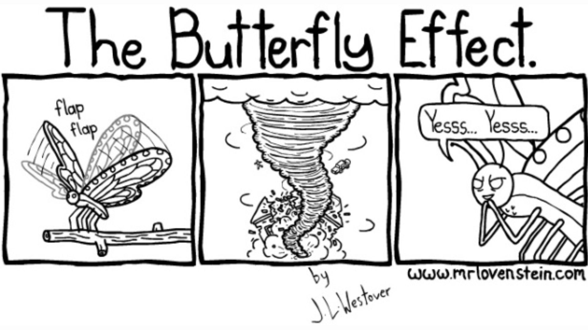
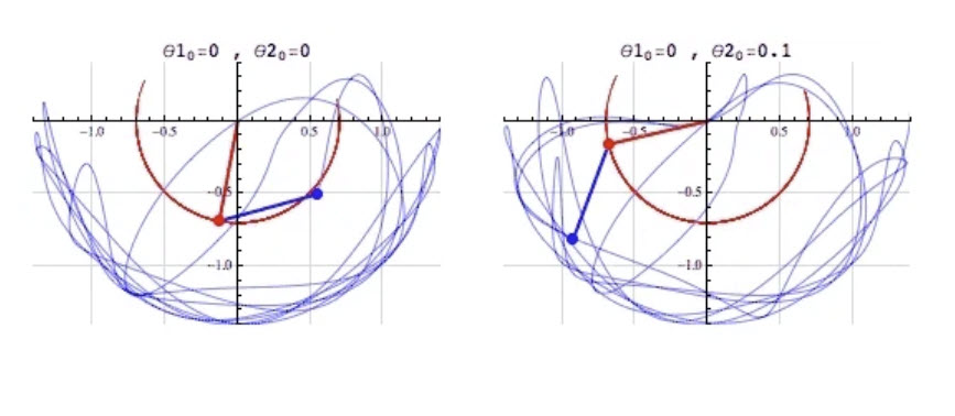
Seemingly chaotic systems like the weather and the financial markets are governed by the laws of chaos theory.
We all have heard about chaos theory, but if you have not or have forgotten what chaos theory is well here you go from interestingengineering.com:
"Chaos theory deals with dynamic systems, which are highly sensitive to initial conditions, making it almost impossible to track the resulting unpredictable behavior. Chaos theory seeks to find patterns in systems that appear random, such as weather, fluid turbulence, and the stock market.
Since the smallest of changes can lead to vastly different outcomes, the long-term behavior of chaotic systems is difficult to predict despite their inherently deterministic nature.
As Edward Lorenz, who first proposed what became commonly known as the Butterfly Effect, eloquently said, "Chaos: When the present determines the future, but the approximate present does not approximately determine the future.""
You may have heard the term about chaos theory as a butterfly flaps its wings in Brazil,...


I for one have lost trust in Medical Doctors due to COVID and reflection that they seem to push pills for everything and untested so called vaccines that is using a unproven technology because the Government and the Medical Boards of the State told them to. There are a very few exceptions. Thus they do not address the key problem just prescribe more and more pills to keep you alive an sick longer for them and Big Phama to profit from you. Will AI do any better? Well that depends on what was used for the training of AI. If it also pushes pills and vaccines without question then you have the same problems noted above. However, if the AI Training includes all possible forms of treatment and they zero in on the right issues for the true problem then there is possibilities they would be way better than most of the current Medical Doctors today.
The following is from an article from interestingengineering.com and written by Paul Ratner:
"A new study looks at how accurately AI can diagnose patients. We interview the researcher, who weighs in on AI's role ...